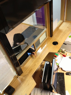
 Basing our decision of what bank cashiers look like on online research (above) and our own knowledge we chose to shoot the pop-up image in the location below. It is the reception of our school and the nature of any reception gives an impression of a bank. This one especially though because of the glass and the slot at the bottom (as if for passing money to and throw).
Our original plan was to have the pop-up from the cashiers point of view, so the robber would be pointing the banana at the camera. This intimacy would've meant the viewer could really feel the humiliation and mistake that the robber made. However we have now decided to have an image that looks like cctv footage of a robbery (top left). This will be more different and eye-catching and make the situation seem more real. This will make the problems bad eyesight can cause more realistic and the viewer's may be more likely to buy the product as a result!
The problem with this location was the background. But now we aren't doing the straight on shot the stairs, hall and notice boards- which do not fit viewer's knowledge of banks- wont be seen.
Here are two brief shots we took this afternoon at our chosen location. We prefer the second shot; it is more clear that it's a bank because of the computer (we will obviously remove the mug and other bits and bobs). And cctv cameras are more often than not located behind the desk. It also means that we can see the characters face more. However the reflection in the glass is a problem that we may not be able to overcome. The purple door doesn't fit the look of a bank so we have discussed having the photo in black and white (below) which we think looks more realistic.
We would have numbers (date and time) to further show that it was cctv footage.
Note that in our actual photo there will be a larger space for our slogan and logo to be on.
We have also considered the altering the quality of the image
to make it look more like cctv footage and therefore more realistic.


After further discussion over our pop-up we agree that the photo will have to be clearer i.e. the banana will have to be obvious and we would position the face so that the reflection doesn't fall over the characters' face.


No comments:
Post a Comment