These are the designs we created for our open tin of dog food. The quality of the first picture wasn't good enough so we found a similar picture of a dog's face (licking lips) on Google images; one of better quality. We then decided we didn't like how goofy and humorous the cartoon dog was; although we need the label to be simple and obvious we also want it to be as realistic- research didn't show any current brands to have such pictures as their logo.
As you can see from the examples the logos are simple and professional and want their customers to take them seriously. Therefore we have decided to go with the last image; simple and realistic, and also friendly. We also decided on the lighter version of the first yellow because it looks healthier and so more realistic.
Basic storyboard for sponsorship. A pull shot will take the first picture to the second.We will hear them chatting away flirtatiously. If we can hear what they are actually saying to each other then it may detract from the point of the advert. So we are considering using non-diegetic sound which will distort their conversation to mumbling. This music would have to be slow romantic/seductive music. The first shot will show them bringing the food up to their mouths, and then match on action will show them putting in their mouths. So that their reactions will be out of focus but not unrecognisable and the focus will be on the product.
During our research process we have learnt that people read pictures as they do text; from top left to bottom right. Below is an example of a magazine advert. As you can see the product is the last thing people will read. The product and product name is framed by the black area of her trousers and background. Therefore we have chosen to put our slogan and logo at the bottom, preferably to the right. It could be framed by the surface we see the dog food tin on (meaning we'd flip the second image horizontally), so that the logo and slogan are the last things the audience takes in.
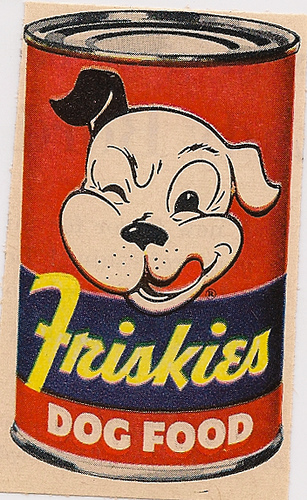
In terms of the dog food tin we can't use an existing product because we'd be advertising a product that didn't belong to us. Furthermore, any existing products' labels are too busy with text. For the audience to understand what's gone wrong and to find it funny; the dog food tin needs to be really obvious and therefore bold and simple. Like the one to the right for example. Because this is an existing product we will change the name Friskies to something else or perhaps not have a name at all; just DOG FOOD (using Photoshop- then printing label and sticking on to a tin).
During the initial discussion of our sponsorship advert we were planning to use a pan or tracking shot. The problem with using a pan shot would be we would have to zoom in to see the details of the meal and then to see the dog food tin. We feel this zoom would look unprofessional and may take away the intimacy we need to portray during the romantic meal- for it to be funny. Although a tracking shot would look effective, and we wouldn't have to zoom in, we don't have a dolly and any make shift one wouldn't suffice! Therefore we will use a pull out shot to reveal the dog food. This will be effective because in the ending shot we can still see the couple about to eat in the background.
This is our draft for our second advertisement. Last friday we filmed in the community hall for 2 hours. The changes we will make for our final advert follow:
The beginning will feature the character asking where life drawing is. The receptionist tells her to follow the signs. This sets the character up to read the signs wrong because of her bad site. She may also tell her where to change; realistically a life model would not turn up to the building in just a robe. This is why we filmed the character coming out from the curtains doing up her robe. We must remember to keep quite during the final shooting so that we don't have problems with sound ("do it again") if we want to adjust the time of each clip. If we do the receptionist scene it will include the main characters walking out of the shot and then a clip of her walking out of the changing rooms. This would be the furthest door in the corridor shot.
There is also issues with the continuity between the first and second shot. This is why we cut the first shot so that she runs out of the shot. This hopefully implies that the second shot is a different scene. We can also see her vest which doesn't look realistic.
We have discussed the necessity of her being late as it may detract from the cause of her mistake; she reads the sign wrong because of her bad eyesight, not because she's in a rush. However, her rush is necessary because without it she wouldn't walk straight into the middle of the group and strip.
During the final shooting of the shot of her walking towards the group while taking her robe off needs to frame more of the main character. It should also feature more people from the group. This involves us recruiting more actors/actresses.
When she drops the robe to the floor she's too close to the group and it doesn't look like she's in the middle of a circle. We think this shot should also include the other side of the circle, for instance another pair of feet between the life model's and the camera. This is to avoid the people looking like a circle and not just a line, which it does.
This is also the case with the shot after. After showing some people outside of the group this draft they commented that they thought the three people in the group were judges, perhaps because charlotte's (middle) legs are crossed and her hands are on her knees. For the advert to be more comedic their expressions of grief and shock must be more exaggerated. This could include mascara running down their faces, blowing noses with tissue, gasps, sniffles, sobbing etc. We will ask some friends who do drama a level to act in our final shoot.
The last shot works extremely well. However we can see her bra straps; we will acquire a skin colour bra for final shoot. The last shot also holds continuity issues; the door she walks through at the beginning has no window, whereas the door in the last does. We have considered the last shot showing the door closing (getting a glimpse of the scene) to reveal the bereavement sign. However we don't want to not use the glass shot.
In conclusion we need to book more time to shoot as many shots need a while to set up and get right (e.g. the shot of the group with the main character's nude side took a long time because the framing had to be perfect). We also need to get more actors to pad out the group and create realism. We realise that our advert is lacking in males which restricts our target audience. However our actress isn't comfortable with males being present during the nude shoot!
This is our advert draft.
In terms of the narrative we agree that it needs to be moreobvious that she's in a rush; to make the mistake of brushing her teeth with paint realistic. This could mean during shot where she leaves she is seen struggling to put on her jacket while packing her bag and walking faster when greeting her neighbour. Or even an extra shot of her rushing down the stairs; this would also help to create continuity because the audience would assume the bathroom is upstairs. We also agree that the reaction of the neighbour needs to be longer to ensure the comedic effect we're going for. Also the shot of the main character walking away to work, oblivious, is important in the humiliation and therefore comedy of the advert. Therefore, it too, needs to be longer. Our slogan and logo will appear, superimposed, on this shot, so it needs to be long enough for the audience to take it in.
Other adjustements: The fade to black at 6seconds needs to be a sudden change, not a fade. This is to give the impression that she is turning out the lights, and going to bed. When we film the final advert we will film the first 6seconds at night time to create realism. So we can actually turn the lights off; the sound of this will create further realism. Filming the rest will happen during daytime, so it will be important for us to keep the camera in the same place for the shots of the paint tube. This may mean we film the 6seconds plus at the beginning of the day, leave the camera in the same place until it gets dark and film the beginning 6seconds.
Looking back at our research of Specsavers adverts we have noted that the punchline is kept a secret till the very end. For instance you don't realise the farmer has shaved his dog until the very end http://www.youtube.com/watch?v=Ubf28LPnfYs . Therefore we think that the shot of her brushing her teeth should be removed and replaced with one where we don't actually see her mouth. Maybe a shot of her eyes looking groggy which will emphasise the fact that has just woken and is tired.
The colour of the paint will not be red because it looks a bit like blood and so may distract the audience from the point of the advert.
We will find some birdsong on youtube to use because there is none on iMovie.
The paint on her teeth at the end lacks in amount and therefore obviousness. This is because we didn't have any chocolate spread on the day. We must remember to buy some for next time!