These are the designs we created for our open tin of dog food. The quality of the first picture wasn't good enough so we found a similar picture of a dog's face (licking lips) on Google images; one of better quality. We then decided we didn't like how goofy and humorous the cartoon dog was; although we need the label to be simple and obvious we also want it to be as realistic- research didn't show any current brands to have such pictures as their logo.
As you can see from the examples the logos are simple and professional and want their customers to take them seriously. Therefore we have decided to go with the last image; simple and realistic, and also friendly. We also decided on the lighter version of the first yellow because it looks healthier and so more realistic.
Basic storyboard for sponsorship. A pull shot will take the first picture to the second.We will hear them chatting away flirtatiously. If we can hear what they are actually saying to each other then it may detract from the point of the advert. So we are considering using non-diegetic sound which will distort their conversation to mumbling. This music would have to be slow romantic/seductive music. The first shot will show them bringing the food up to their mouths, and then match on action will show them putting in their mouths. So that their reactions will be out of focus but not unrecognisable and the focus will be on the product.
During our research process we have learnt that people read pictures as they do text; from top left to bottom right. Below is an example of a magazine advert. As you can see the product is the last thing people will read. The product and product name is framed by the black area of her trousers and background. Therefore we have chosen to put our slogan and logo at the bottom, preferably to the right. It could be framed by the surface we see the dog food tin on (meaning we'd flip the second image horizontally), so that the logo and slogan are the last things the audience takes in.
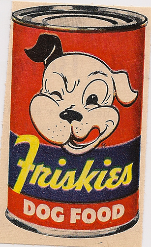
In terms of the dog food tin we can't use an existing product because we'd be advertising a product that didn't belong to us. Furthermore, any existing products' labels are too busy with text. For the audience to understand what's gone wrong and to find it funny; the dog food tin needs to be really obvious and therefore bold and simple. Like the one to the right for example. Because this is an existing product we will change the name Friskies to something else or perhaps not have a name at all; just DOG FOOD (using Photoshop- then printing label and sticking on to a tin).
During the initial discussion of our sponsorship advert we were planning to use a pan or tracking shot. The problem with using a pan shot would be we would have to zoom in to see the details of the meal and then to see the dog food tin. We feel this zoom would look unprofessional and may take away the intimacy we need to portray during the romantic meal- for it to be funny. Although a tracking shot would look effective, and we wouldn't have to zoom in, we don't have a dolly and any make shift one wouldn't suffice! Therefore we will use a pull out shot to reveal the dog food. This will be effective because in the ending shot we can still see the couple about to eat in the background.
This is our draft for our second advertisement. Last friday we filmed in the community hall for 2 hours. The changes we will make for our final advert follow:
The beginning will feature the character asking where life drawing is. The receptionist tells her to follow the signs. This sets the character up to read the signs wrong because of her bad site. She may also tell her where to change; realistically a life model would not turn up to the building in just a robe. This is why we filmed the character coming out from the curtains doing up her robe. We must remember to keep quite during the final shooting so that we don't have problems with sound ("do it again") if we want to adjust the time of each clip. If we do the receptionist scene it will include the main characters walking out of the shot and then a clip of her walking out of the changing rooms. This would be the furthest door in the corridor shot.
There is also issues with the continuity between the first and second shot. This is why we cut the first shot so that she runs out of the shot. This hopefully implies that the second shot is a different scene. We can also see her vest which doesn't look realistic.
We have discussed the necessity of her being late as it may detract from the cause of her mistake; she reads the sign wrong because of her bad eyesight, not because she's in a rush. However, her rush is necessary because without it she wouldn't walk straight into the middle of the group and strip.
During the final shooting of the shot of her walking towards the group while taking her robe off needs to frame more of the main character. It should also feature more people from the group. This involves us recruiting more actors/actresses.
When she drops the robe to the floor she's too close to the group and it doesn't look like she's in the middle of a circle. We think this shot should also include the other side of the circle, for instance another pair of feet between the life model's and the camera. This is to avoid the people looking like a circle and not just a line, which it does.
This is also the case with the shot after. After showing some people outside of the group this draft they commented that they thought the three people in the group were judges, perhaps because charlotte's (middle) legs are crossed and her hands are on her knees. For the advert to be more comedic their expressions of grief and shock must be more exaggerated. This could include mascara running down their faces, blowing noses with tissue, gasps, sniffles, sobbing etc. We will ask some friends who do drama a level to act in our final shoot.
The last shot works extremely well. However we can see her bra straps; we will acquire a skin colour bra for final shoot. The last shot also holds continuity issues; the door she walks through at the beginning has no window, whereas the door in the last does. We have considered the last shot showing the door closing (getting a glimpse of the scene) to reveal the bereavement sign. However we don't want to not use the glass shot.
In conclusion we need to book more time to shoot as many shots need a while to set up and get right (e.g. the shot of the group with the main character's nude side took a long time because the framing had to be perfect). We also need to get more actors to pad out the group and create realism. We realise that our advert is lacking in males which restricts our target audience. However our actress isn't comfortable with males being present during the nude shoot!
This is our advert draft.
In terms of the narrative we agree that it needs to be moreobvious that she's in a rush; to make the mistake of brushing her teeth with paint realistic. This could mean during shot where she leaves she is seen struggling to put on her jacket while packing her bag and walking faster when greeting her neighbour. Or even an extra shot of her rushing down the stairs; this would also help to create continuity because the audience would assume the bathroom is upstairs. We also agree that the reaction of the neighbour needs to be longer to ensure the comedic effect we're going for. Also the shot of the main character walking away to work, oblivious, is important in the humiliation and therefore comedy of the advert. Therefore, it too, needs to be longer. Our slogan and logo will appear, superimposed, on this shot, so it needs to be long enough for the audience to take it in.
Other adjustements: The fade to black at 6seconds needs to be a sudden change, not a fade. This is to give the impression that she is turning out the lights, and going to bed. When we film the final advert we will film the first 6seconds at night time to create realism. So we can actually turn the lights off; the sound of this will create further realism. Filming the rest will happen during daytime, so it will be important for us to keep the camera in the same place for the shots of the paint tube. This may mean we film the 6seconds plus at the beginning of the day, leave the camera in the same place until it gets dark and film the beginning 6seconds.
Looking back at our research of Specsavers adverts we have noted that the punchline is kept a secret till the very end. For instance you don't realise the farmer has shaved his dog until the very end http://www.youtube.com/watch?v=Ubf28LPnfYs . Therefore we think that the shot of her brushing her teeth should be removed and replaced with one where we don't actually see her mouth. Maybe a shot of her eyes looking groggy which will emphasise the fact that has just woken and is tired.
The colour of the paint will not be red because it looks a bit like blood and so may distract the audience from the point of the advert.
We will find some birdsong on youtube to use because there is none on iMovie.
The paint on her teeth at the end lacks in amount and therefore obviousness. This is because we didn't have any chocolate spread on the day. We must remember to buy some for next time!
These are a few more pictures that we took as an update of our previous Web Pop-up pictures. We decided to go back and see how it looks from slightly different angles mainly because the banana is the main point of the advert and it wasn't that obvious from so far away. We also bought a banana and used this as we would in the final Web Pop-up, this is to get a better understanding of how to make the banana obvious.
In the first picture, we took this in front of a white wall to get a clear shot of the robber. This is not what we would use for our final Web Pop-up but we wanted to get an idea of how the robber should hold the banana. Although the banana is out of shot we agree that having the robbers' arm at full length the banana is as large as possible would make the situation much more clear and adds to the humour.
In the third and fourth pictures, we took from the Cashiers point of view. After deciding that having a shot from a CCTV angle is out the picture, we choose to have it from this angle. We like the fact that this angle makes it more intimate for the audience and also gives a much more clear picture of the robber and his mistake. These are all draft pictures for what it will look like, but when taking the final picture we will most likely use a lower angle, this makes the Cashier looks vulnerable and the robber looks more powerful, even though what he thinks is a gun is actually a banana. We intend to use this angle and at the same time, incorporate what we talked about in picture two. So we want the banana to be much bigger and closer to the audience and the shot to be from the Cashiers point of view. We are using a different person to act as the robber, we are going to use a male student from our school who is much taller than we are, this way it is more of a stereotype for a robber.
We have decided that we think the top photo would be best. The mis en scene of our chosen location does not look bank-ish enough and may confuse the audience. We want the mis en scene to be instantly recognisable so the robber must conform to stereotypes; this has led us to introduce the idea of him having a swag bag.
For the life drawing model we think a robe would be most appropriate. The one we are also using in our first advert fits the role perfectly! We will have to find a tie that is of the same colour. This should be easy.
The group in the bereavement support meeting will wear dull clothes; maybe some black clothes to give the impression of mourning.
Basing our decision of what bank cashiers look like on online research (above) and our own knowledge we chose to shoot the pop-up image in the location below. It is the reception of our school and the nature of any reception gives an impression of a bank. This one especially though because of the glass and the slot at the bottom (as if for passing money to and throw).
Our original plan was to have the pop-up from the cashiers point of view, so the robber would be pointing the banana at the camera. This intimacy would've meant the viewer could really feel the humiliation and mistake that the robber made. However we have now decided to have an image that looks like cctv footage of a robbery (top left). This will be more different and eye-catching and make the situation seem more real. This will make the problems bad eyesight can cause more realistic and the viewer's may be more likely to buy the product as a result!
The problem with this location was the background. But now we aren't doing the straight on shot the stairs, hall and notice boards- which do not fit viewer's knowledge of banks- wont be seen.
Here are two brief shots we took this afternoon at our chosen location. We prefer the second shot; it is more clear that it's a bank because of the computer (we will obviously remove the mug and other bits and bobs). And cctv cameras are more often than not located behind the desk. It also means that we can see the characters face more. However the reflection in the glass is a problem that we may not be able to overcome. The purple door doesn't fit the look of a bank so we have discussed having the photo in black and white (below) which we think looks more realistic.
We would have numbers (date and time) to further show that it was cctv footage.
Note that in our actual photo there will be a larger space for our slogan and logo to be on.
We have also considered the altering the quality of the image
to make it look more like cctv footage and therefore more realistic.
After further discussion over our pop-up we agree that the photo will have to be clearer i.e. the banana will have to be obvious and we would position the face so that the reflection doesn't fall over the characters' face.
In terms of company name we couldn't use 'Specsavers' so we set about creating a new brand for our product.
Options:
1. Vision Express- Already taken!
2. VisionPro- 'Pro' doesn't exactly appeal to mainstream; doesn't give an impression of reasonable, affordable prices.
3. Specksavers (spelling difference).
4. 20/20- Refers to 20 out of 20 sight; the best possible sight. By using this we imply to our audience that we can help them achieve this, or to some extent.
We have chosen the last one as it is relevant and extremely catchy. After doing some research we discovered that the majority of people don't know what 20/20 is. So to make the purpose of our brand and product more obvious we have decided to call it'20/20 vision'. So that those people at least know it's to do with eyesight.
Above is the completed brand logo. When choosing the colour scheme, we decided on light blue for the '20/20' as it has strong connotations of medical professionalism and therefore reliability (people associate blue with medical practices uniforms?), whilst black is solid (suggesting reliability) and eye-catching. Here are some examples of existing medical logos and as you can see blue is a popular and therefore appropriate colour.
Using photoshop, we tried a variety of different fonts before deciding on one that looked sharp to represent the 'sharp' sight we will be offering our customers. The 'V' whilst being also a 'forward slash' can be seen as tick- this therefore has positive connotations.
Note that our slogan won't be 'Should've gone to 20/20 Vision' as that is too long-winded and not as catchy as simply 'Should've gone to 20/20'. Also note that the background is not intended to be white. Similar to Specsavers (right) we think a lack of background looks more professional and tidy. This means we must make sure that our logo is composed so that it's background is plain and of opposite colours; so that it's legible.
These are shots of some potential locations for our sponsorship idea which we took around the school. We chose school a) because it's practical and b) because meetings, like book clubs and AA meetings, are often held in schools. The school setting adds to the realism of the AA meeting that will be being held in our advert. I think the second location looks most realistic; it looks more like a separate room unlike the first one which, with all it's doors and windows, is obviously a corridor of sort. The third location's furniture is way to bright and we are concerned that it will detract attention form the focus of the advert. The carpet and dark walls of the last location don't fit with our criteria!
We hoped to take some shots of the community hall at Cheney school, as this is the kind of place AA meetings would genuinely happen, but it was being used today. We are now waiting for an email which will let us know what date we use it.
Here are 4 different locations in our school which we could possibly use to film the second advert.
We have chosen to film in school because it is very practical for us and also the fact that meetings (AA meetings etc) take place in community buildings such as schools. The locations we have chosen will add to the realism of the advert and the way that we will lay out the chairs (in a circle) and the mise en scene we use will also add to the realism.
We think that the second location looks the most realistic, this is because it looks like a separate room, unlike the first one where you can see doors and windows from all angles. The third location is much too bright for our liking, whereas the fourth is much too dark due to the dark blue paint and carpet. If we decided to use the third location, we are afraid that this will take all the attention away from what is going on in the advert and distraction is also a concern of ours if we used the fourth location.
There is one more location that we are waiting to look at which is Cheney Community Hall, this is the kind of place where an AA meeting would be held therefore we want to see what it looks like and leave this as a potential place for filming. We went there the day that we took all these location shots but unfortunately it was being used so we couldn't go in, but we are not waiting for an email to confirm the day that we can go and see it.
We have come up with an idea for our second tv advert. The camera will scan over a couple having a romantic meal at home. It will then scan over to the kitchen and show an open tin of dog food among the ingredients used to cook the romantic dinner. Our initial idea was to show one of the couple preparing it, using dog food. But then an element of comedy is lost if the audience find our straight away. As a result of the way we are filming it, the advert will be relitively short. Therefore we have decided to use this idea for our sponsorship advert. This means we will use the life model idea for our second advert. While further discussing our sponsorship advert we have realised that we need more time to tell the audience what is actually happening. It may not be obvious that she is a life model unless we have her ask the receptionist where it is for example.
This is our sponsorship storyboard. Like in the Specsavers sauna advert the audience wont realise the mistake the character has made until the character realises (the audience are therefore more likey to relate to the character's bad sight). To do this the audience can't know it's a bereavement support meeting until right at the end; so the only bit of the group you see is in shot 3 when the back of someone's head is seen watching the character rush over.
To keep the professionalism of the advert no nudity will have to be shown and we will imply this through shot 4 and 5.
The door closes in the last shot revealing the sign saying 'Bereavement Support Meeting'. We chose this meeting, and not say an AA meeting, because it makes the nudity even more innappropriate and therefore funny. This is also a perfect space for our logo and slogan to appear.
This is a white shirt which we will smear paint on it to tell the audience that she has been painting. Along with casual non-discrete black leggings. To add to her artistic, care-free representation that'll add to the realism of her making the mistake, the buttons will be done up wrong.
In the morning the fact that she has just woken up and is groggy and prone to not noticing the taste of paint in her mouth. We chose white so not to detract attention form the importance of the paint.
These are three potential work outfits. They are smart and imply that she is going to work. This smartness will contrast with the humiliating paint and further add to the humour. We prefer the top two; they are the most typical smart-cas clothes. The bag in the top photo is the one we most likely will use; it is smart.
Incase her feet are in shot (when she leaves the house) these are some potential shoes. We think the top ones are most smart and non-discrete.
All of these aspects of her appearance construct the representation of a normal working woman, someone with whom the audience can relate to.
This is a brief photographic storyboard of our tv advert.
Cleaning her pallet.
From this shot, will be closer up to emphasise attention on the paint being left there. She will shortly finish cleaning up and leave the bathroom. The shot camera will stay on the paint close-up and she will turn the light off.
The shot will be black, as the light has been turned off. Birdsong and maybe an alarm will play and the previous shot will come back in via fade.
The audience will not directly see the paint in her mouth. We want this to be revealed at the end for comedic effect.
Match on action.
Neighbour putting out bins.
Her paint-covered teeth is finally revealed.
Speechless neighbour!
I think this would be a good last shot as it'll stick with the audience. It's a reaction that the audience do not wish to provoke from their neighbours. To secure that this does not happen to the audience the advert suggests that they should go to Specsavers.
After discussing ideas for our sponsorship advert. We found limitations of the Come Dine With Me idea and the Animal idea but have all agreed that the life model idea would be funny and effective. Plan for sponsorship: 1. Woman turns up for life model drawing class. Receptionist tells her its down the corridor on the left door that reads 'life drawing' 2. Woman walks past life drawing room and into another room where she takes off her robe (camera does not show her naked, but robe falling onto floor) 3. The room she has gone into is a bereavement group and the camera films closeups of them crying 4. A voice over or other source displays '2020, sponsors of Nude Today' We found a 5 part documentary of Channel 4 which would be a perfect programme to sponsor; Nude Today. The link follows. http://www.channel4.com/programmes/life-class-todays-nude/episode-guide/series-1
Our initial Specsavers research led us to watch this advert (left) which is where we got the inspiration for this idea from. An embarrassment for nudity is something most people have in common and so the majority of people will find this funny.
When deciding the costume ideas for our actors in the web pop up we decided to correspond to audiences stereotype by using outfits they would expect a robber to be wearing. This is because we don’t want to detract attention away from the banana in the shot as this is the focal point. With something that the audience wouldn’t expect to see, e.g bright clothing, the audience would be aware of the costume and perhaps even question it. We presented our target audience with two images of the robbers in two different costumes and asked them to state the one in which they noticed the banana sooner. The costumes were:
1. Dark clothing- black baggy jumper and dark jeans. 2. Horizontal black and white striped jumper and jeans
We found that the majority of our target audience noticed the banana in the robbers hand earlier in costume idea 1. With this piece of information, we will use dark clothing. Additionally the stripy clothes may detract from the banana. Setting Ideas:
Similarly to the costume idea, there are certain objects that people expect to see when imagining a bank robbery. If there are objects that correspond to their schemata, they are more likely to remember it which is vital for our advert as we want it to stick with the audience. We have looked at studies carried out by researchers such as Loftus and Palmer to find out what people expect to see in a bank robbery. These included: 1. A man wearing a balaclava
2. A getaway car3. A woman screaming 4. Robber carrying a gun 5. Robber carrying a black bag full of cash We would like to include some of these in our web pop up to increase realism. As it is highly unlikely that we will be able to take the photograph in an actual bank, we have to consider locations that are possible. Other possible locations include our school and parents work place however we are looking into this further and will take practice shots at different locations to compare.
We have discussed the use of diegetic/non-diegetic sound in our advert. Is music really relevant? Usually music is used to provoke a certain emotion/feeling, and as our advert's main concern in creating humour it seems unnecessary.
I have included this advert in my research and in this Specsavers advert it is the diegetic sound which is important in emphasising what actually happens and what is funny. You can tell the vulnerability of these two people by their conversation and hearing the birds in the background makes it a more reaslistic situation, not to mention the screams of the other passengers on the rollercoaster having a good time compared to this elderly couple who are obviously clueless without glasses.
Whereas in this Specsavers advert the music is important in creating a specific genre and building up the shepherd's strong wise character which only makes his oblivion to sheering his dogs funnier. This is not the comedic angle we wish to take in our advert so for now we plan not to use music. It'd be easy for us to add music after if we feel it is needed; for example to hide bad diegetic-sound.
One type of diegetic sound that we will definitely use will be the birdsong and alarm ringing to inform the audience of the arrival of morning!
This is our up to date storyboard. I think the close-up of her leaving the paint on the side is important. It subtly suggests what is about to happen. This creates humour. Her looking tired is also important as it creates realism; the audience will be less likely to say "wouldn't she taste the paint!". The last shot highlights her humiliation and plays a role in persuading the audience to not let this happen to them. It is important that the audience understand she is an artist, for the situation to be accepted, and so her costume in the first shot may be her in a shirt with paint on it. She will then wear a dressing gown while brushing her teeth to further imply that it's morning. Last of all at the end, when she leaves the house, she will be wearing smart outdoor clothes to show that she is walking to work. We chose work because it is the place that would be most embarrassing; because of the need for professionalism there.
When deciding the costumes that our charcters will be wearing we have to take into condieration their age and who the audience is meant to appeal to. Our main character is going to be a woman who is in a rush to leave the house, most probably late for work, therefore we have to think of ways to make the outfit seem as though she has been in a rush but still dressing up for work while also trying to make it seem realistic and relate her to the audience. We think her job could involve her having to dress quite smart, trying to look more professional and this creates more of a contrast between the way she is dressed and that fact that she has got black teeth. Having her dressed smart also shows that even people who are in professional jobs, who other people would assume to have everything together, can aslo be vulnerable and buying glasses eliminates that. Having the woman dressed like this for work is appealing to our target audience of The Mainstreamer because they can realte to this situation. Here is one example of what we think the woman could be wearing: She could either be wearing a smart/casual suit to go to work or something like a dress which is a bit more feminine but still smart. This creates comedy in the advert because the audience will laugh at the fact she is a professional woman but still made the mistake of brushing her teeth with paint and not noticing. Here is another exmaple:
Out of all our bathrooms this one is the most appropriate. It is relatively spacious allowing room for shooting and the simple black, white and cream theme will not detract from the point of the advert. Our target audience is mainstream so it's important for as many aspects of our advert to be not too particular. When shooting we will obviously tidy it up( bottles on window sill) and remove the blue basket which is rather distracting.
We have been thinking of possible ideas of the kind of programme that we could sponsor. We have already come up with an idea of sponsoring something like 'Come Dine With Me'.
While researching sponsorship adverts, we came across one for 'Come Dine With Me' and their concept was similar to what we intend to do: they acted as if they were in the show and inviting guests over for dinner. They did not use humour in their advert because it was for a wine, they just showed a few guests coming over and giving the wine as a present and the host being extremely pleased. We think that including humour in our advert would attract the audience more and leave a more memorable impression in their minds.
We thought the advert could be of a woman/man preparing a meal for their guests. The person could be making the meal and because of lack of sight, accidentally use something like dog food in the cooking instead of the proper ingredients. We would then see the reaction of the guests eating the food and perhaps a shot of the empty dog food tin in the kitchen for example. Although this would have ruined the meal, we will see them all laughing about it because we do not want to end the advert on a bad impression and everyone being upset because this will not be appealing to the audience. This advert will relate well to the programme it is sponsoring because that is exactly what the programme is about, it also contains humour which we intend to use in our other advert we are making.
Looking at the results to our questionnaire, we can see that our target audience, The Mainstreamer, like to keep up to date with the latest fashion but still consider the price and comfort of the glasses they are buying. From this information, we know that having an advert which includes humour rather than focusing on what brand the glasses are and how great they look will appeal more to our target audience. In an advert focusing on designer glasses, they tend not to mention the price but concentrate more on telling the audience how great they look, but looking at our questionnaire we know that our audience want something that is good quality and good price, therefore we will most likely not sponsor a programme like 'Project Runway' or 'Next Top Model' because these programmes are all about how you look and not about comfort or prices etc. It is important to sponsor a programme that our target audience will also be likely to watch and frequent and entertaining programmes which include slight comedy such as 'Come Dine With Me' and 'Dinner Date' are examples of the type of programme which we would like our advert to sponsor.
This is a sketch of our pop-up idea of a robber, having not gone to Specsavers, not noticing the fact that he's using a banana instead of a gun. I think it'd be important for us to include a background of a bank to confirm to the audience the fact that he is robbing it. Without the background the balaclava is the only indication. This also includes humour and this is something that we want to use in all of our work on the Adverts and Pop-ups. We also need to have something to click on to attract customers, something like 'Click here to find out what happens next' or 'Click here for 2 for 1 glasses', or anything that will get the customers interacting and interested. A Web Pop-up is used to tell the audience what they could get, but they need an annotation to click on to find out how they can get this. We are aware that we will need to include more information on our Pop-up but we are still discussing what we should have. We want something that will attract the audiences attention and make them want to click on an annotation, this way we can explain in more detail about what we are offering, but the only way to do this is by grabbing their attention in the first place with this Pop-up. We also need to make the writing much bigger, making it more clear the brand of the product. One idea we've had is to have a link saying "See what happens next by clicking here". Implying the link would result in a video or some other type of media which explains the end of the narrative. This would be because our pop-up focuses/relies on comedy and entertainment to attract our audience and not information; e.g. good deals, like most pop-ups.
When we make our real Web Pop-up we are going to use a real person and not a drawing, this way it is more realistic and believable, also making it funnier because it creates a sense of realism. We are still thinking of the background that we could use, although we don't think that it will be easy to walk into a bank with someone wearing a balaclava and take pictures of them! We are considering using a background of somewhere around school, this would be practical, and the reception, for instance, has a desk and sliding doors similar to those in a bank. We are also considering using a Green screen and putting a picture of the inside of a bank behind the person, although making this look real would would be difficult, especially in terms of difference in lighting.
In terms of design of our web pop-up we understand the importance of synergy. The decided font and colours of our branding will be consistent throughout the tv advert, the tv sponsorship advert and the web pop-up. The thought we have put to this has established the appropriateness of a relatively neutral colour and font; where some campaigns use bright colours and fonts to catch the audience's eye, ours is using humour. A neutral colour and font offers a more serious side; the audience need to take our product seriously because sight is very important to people.